

Sam Wear — one of New York’s pre-eminent GIS leaders — published a fun interview with me about our mapping work at the CUNY Graduate Center. I’m honored!
Filed under: GeoWeb, Social networking | Comments Off on eSpatiallyNY profile
At @chrislhenrick‘s request, I’ve posted a link below to a zipped version of the NYC LION data set in shapefile format (which I explore further in my post below).
The NYC Dept of City Planning only provides an ESRI Geodatabase, which is native to ESRI software, therefore presenting a challenge to people using non-ESRI applications. Although the shapefile format is technically also proprietary to ESRI, it’s become a de facto open format, easily read/consumed by other software packages such as QGIS (from which you can simply “save as…”, for example, to almost any other format you want).
Preferably NYC Planning would provide access to the LION file in this and/or other formats at the Bytes of the Big Apple website (many other data sets are available there in shapefile format and other formats). But until they do, here’s a link to my version of it, converted from geodatabase to shapefile:
NYC LION file (ver. 15c); link to zipped shapefile
Hope this helps!
Earlier this year our team at the CUNY Graduate Center worked on a project that involved extensive use of the NYC LION file.
According to the metadata, “LION is a single line representation of New York City streets containing address ranges and other information.” The centerline GIS data, as well as the “other information” in LION, is pretty impressive, and this blog post highlights some of the really neat nooks and crannies in the data.
LION-the-name is of a piece with TIGER, the US Census Bureau’s massive spatial data set of the nation’s street grid (and other Census statistical areas). Both are kinda (too?) cute “backronyms” – TIGER as shorthand for Topologically Integrated Geographic Encoding and Referencing files. LION stands for Linear Integrated Ordered Network, presumably pieced together to represent an equally fierce jungle animal symbolically showing that NYC’s street centerline data was just as impressive. LION is now part of the city’s newer City Street Centerline (CSCL) project, also an impressive effort but a much tamer string of initials – not even an acronym, and nowhere close to BEARs, which IMHO would’ve been the perfect Oz-like grouping (“LIONs and TIGERs and BEARs, oh my!”).
Anyway, according to a 1996 version of the LION User Guide:
The LION file has been maintained by DCP [NYC Dept of City Planning] as a major component of the Geosupport System. It is a single line representation of New York City streets containing address ranges and other information. The LION file has also been used for automated cartography within DCP. The increasing use of microcomputer-based mapping and geographical information systems within the City’s government has led to the development of the BYTES of the BIG APPLE™ files.
In 1996, the LION dataset was spread over several files occupying 14 MB of disk space. The latest version of LION is available as an ESRI geodatabase occupying almost 130MB of disk space, almost 10 times as large. There were a number of attribute fields in 1996, but nowhere near the more than 100 fields available today.
In this expanded set of attributes lies all sorts of fascinating ways of describing and representing New York City’s street system. Of course LION can be used to just display streets throughout the city. But there’s lots more in the file, not all of which is obvious.
For example, LION has an indicator for curved vs. straight street segments, and whether the curve is “irregular” (i.e, not a circular arc) or if it’s a “circular arc lying on the left [or right] side of the segment’s directed chord.” Wow.
As you might imagine, there aren’t too many curved streets within Manhattan’s grid. But in the middle of Manhattan in Central Park, curved streets are the norm. Here they are in something of an abstract neon light display (rotated 29 degrees from north):

The red lines are “irregularly curved segments”, the green lines are circular arcs — remember that the lines may represent multiple connecting segments, so even though a green line may not look like it’s part of a circle, each segment along the line may be its own circular arc.
Note that you can click on each map image in this post to see a larger version.
The image below is the Mill Basin neighborhood in Brooklyn (rotated about 320 degrees), highlighting the amphitheatre-style street layout:

Prospect Park’s curved streets (rotated about 130 degrees) take the shape of some sort of prehistoric neon species:

And Wards Island (rotated about 303 degrees) looks like … well, you can decide based on your own interpretation:

The LION data can be used to highlight certain types of streets, such as highways/parkways, bridges, and tunnels, as illustrated below (based on the RW_TYPE & NONPED fields, using the filter RW_TYPE in (‘ 3’, ‘ 4’ , ‘ 2’) or nonped = ‘V’):

Also, the white lines above are borough boundaries as indicated by LION segments, based on the LocStatus field (where LocStatus is 1, 2, 3, 4, 5, or 9).
Or, LION can isolate where the city’s pedestrian-only pathways are located, as represented below (based on the TrafDir field where TrafDir = ‘P’, ie., ‘Pedestrian path: Non-vehicular’) – notice the almost complete ring around Manhattan, as well as along much of south Brooklyn’s waterfront:

Or railways – not only the subway lines, but rail lines such as the Conrail freight line in Queens and the Bronx, Metro North, and PATH (based on the FeatureTyp field where 1 is Railroad, and the different colors below are based on “street”, i.e. rail, name groupings):

Light blue are subway lines, yellow is AirTrain, dark blue is the Staten Island Railway, green is PATH, brown are the various LIRR lines in the city (including the Bay Ridge freight line), red is Metro North, and purple is Amtrak/Conrail.
LION can be used to locate “non-addressable place names” (NAPs), or “geographic place names that cannot be combined with a house number to form an address” (per the City Planning Department’s Property Address Directory user guide [PDF]).
Examples of NAPs in the city’s street centerline file include the Empire State Building, Columbia University, or even the Coney Island Cyclone. Even though each of these locations likely has a street address, there’s no “25 Empire State Building” or “350 Columbia University”. The names themselves have been georeferenced by DCP so that the names alone can be used for geocoding and map display.
The way these NAPs are represented in LION is that DCP adds a street name synonym to the closest street segment for each NAP location. The images below give you a sense of how these show up on the map. In other words, the LION file can be used to approximate a database of all sorts of important facilities, cultural icons, housing complexes, schools, etc throughout the city. For the two maps below I used the following filter based on LION attributes:
“FeatureTyp” = ‘2’ or ( “SpecAddr” in ( ‘G’, ‘N’, ‘V’, ‘X’, ‘P’) )
… and I labeled the segments with the SAFStreetName field (described in the LION metadata as a “Special Address Place Name”).
The first image below shows some the mapped NAPs in and around Coney Island (definitely click the image for a larger, clearer view):

The next image shows NAPs in the Lower East Side:

Some of the LION segments in the images above are very precise (such as El Jardin Del Paraiso, represented by a very narrow piece of the street segment along East 5th St). Others extend along an entire city block or more, such as PS 15 or New York Aquarium in the images above.
LION includes more than street segments. It also includes line representations of borough boundaries (as shown in the highway/bridge/tunnel map above), administrative district boundaries (such as Police Precincts or Community Districts), and Census block and tract boundaries.
The LION file also includes some history regarding the Census geography. The latest version of LION includes attribute fields indicating which segments align with Census block and tract boundaries not only in 2010, but also in 2000 and 1990.
By filtering segments where the 2010 Census attribute fields don’t match 2000 (LCT2010 <> LCT2000 or RCT2010 <> RCT2000 — where L stands for the left side of the segment and R the right side), we can see where Census tracts changed in the last decade (yellow-orange in the map below is where the 2010 tract identifiers didn’t match 2000; blue are all the other tract boundaries as represented by LION street segments):

These changes could’ve been simply due to different tract numbers from one decade to another, but also could’ve been the result of tract geometry being split or combined.
There were far fewer changes between 1990 and 2000, represented in red in the map below:

Finally, each LION segment is tagged with its corresponding zoning map ID from the Dept of City Planning’s sectional zoning maps. The image below uses a random color pattern to highlight the zoning sections across the city (otherwise mapped at DCP’s website as a simple grid):

(I was inspired for the zoning section map by these maps by Stephen von Worley of Data Pointed.)
There’s lots more interesting data in LION where these examples came from. Check out LION’s metadata, and hopefully you’ll be able to use the LION file for much more than just streets. (Btw, each map above was made using ArcGIS Desktop mapping software.)
Filed under: Uncategorized | 1 Comment »
 In September 2015, the MTA opened its first new subway station in NYC in decades. I’ve added the new station and extension of the 7 line to the Center for Urban Research’s (CUR’s) maps and underlying GIS data, and we’re making this updated data freely available.
Here’s the post at CUR’s website, and here are the links below with the data:
If you use the data (which I hope you do), please let me know how it works out. If you use the files, please reference the “Center for Urban Research at the Graduate Center/CUNY” especially if you use the layer symbology in any printed maps or online applications. Thanks!
Filed under: Cartography, Data | Tagged: Data, NYC, Transit | 2 Comments »
Lately NYC agencies have started to step up the pace in producing an impressive amount of publicly accessible GIS (and other) data. It’s a very good direction (and hopefully one that all agencies will soon follow).
This summer, the big news was that MapPLUTO was all of a sudden available for free. And then ACRIS was opened up (not geospatial, but key to analyzing spatial patterns of property transactions). And before that HPD had posted a large amount of housing data (albeit in a wacky XML format, but nonetheless it was a lot and it was freely available and it was being updated regularly).
But today there’s even more…
The latest news – spotted by eagle eye GIS star Jessie Braden – is that historical versions of PLUTO and MapPLUTO are now freely available, going back to 2002. Really great.
And City Planning included an important but bittersweet note at the historical download page: sweet because all of us who had to sign licenses to obtain PLUTO data are now absolved from the license restrictions, but bitter because there was no mention of the thousands of dollars each of us have had to spend unnecessarily over the years to obtain that data that is now online for free. Sigh. Here’s the note:
Note to Licensees:
DCP releases all licensees of PLUTO and MapPLUTO versions 02a through 12v2 from all license restrictions.
One thing to point out about the historical PLUTO data is to be careful if you’re hoping to compare and analyze parcels year to year. Our team at the CUNY Graduate Center tried that a few years ago, and it was painful. So many data inconsistencies and related issues. The best we were able to do was display historical land use patterns via the OASISnyc.net website (for example, look at the disappearance of industrial land use in Williamsburg from 2003 to 2010). I’d be glad to explain in more detail if anyone is interested.
Other good news for all of us who use the city’s GIS data is that it seems that building footprints are being updated on a more regular basis, and more attribute information is being added (hat tip to Pratt’s Fred Wolf for discovering it). The latest building footprint data is dated September 2013, and includes new attributes such as building height and type, and includes a supplemental data set on “historic” buildings (ie., ones that have been demolished, with date of demolition).
Thankfully the NYC Dept of City Planning staff are continuing to maintain the Bytes of the Big Apple website, where the PLUTO data is available along with many other spatial and non-spatial planning-related data sets. The Bytes pages provide essential metadata about each data set, easily accessible contact information, and context about the data sets.
All of that is missing from the city’s open data portal, which I think is a major failure with the city’s open data practices. (Someone even commented on the buildings data set noted above, asking great questions about how the building heights were calculated, and about the source of these calculations – essential information that is too often missing from data sets available through the portal, though usually included when you download the data from the agencies directly.)
As long as the data portal doesn’t undermine invaluable agency websites like Bytes of the Big Apple, and more data keeps getting freed and accessible on these agency sites, that’s a great thing. And hopefully more agencies will either continue to maintain their own online data repositories (such as the departments of Buildings, Finance, HPD, Health, and others) or launch new ones (such as MTA did a couple of years ago).
… and big kudos to the City Planning department for explicitly posting the historical PLUTO data sets!
Filed under: Data | Tagged: Data, NYC, Policy | 1 Comment »
Download away! http://www.nyc.gov/html/dcp/html/bytes/applbyte.shtml
This essential corpus of public data is now (finally!) freely accessible. According to the metadata:
Access Constraints: MapPLUTO is freely available to all New York City agencies and the public.
Thanks to:
Filed under: Data | Tagged: Data, NYC, Policy | 10 Comments »
NY1 – New York City’s 24-hour cable news channel – featured the maps in a segment they aired during the Thursday, June 20 segment of the “Road to City Hall”. We’ve posted a link to the video below:
NY1 Road to City Hall 6/20/13 segment on Who Represents Me
The Graduate Center also posted a news release about the project.
Today our Center for Urban Research at the Graduate Center / CUNY joined with the League of Women Voters to launch an online service so anyone can identify their elected officials in New York City.
The idea behind this “Who Represents Me” service is not new (in fact, my old team at NYPIRG’s Community Mapping Assistance Project pioneered it more than a decade ago). But now that redistricting has changed all the legislative boundaries in the city (and the City Council lines will all be new by January 2014) it seemed like the perfect time for a reprise of our Who Represents Me service from 2000, updated with new data and new technology.
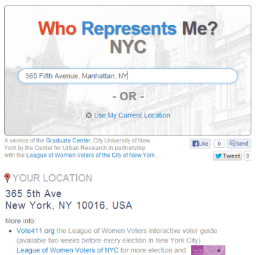
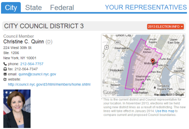
Anyone can enter a street address at the “Who Represents Me” website, or if they’re using a mobile device they can tap the Use My Current Location link. The site displays a list of all city, state, and federal elected representatives (as well as NYC Community Board), an interactive map of the district and all districts nearby, contact information for local offices, and links for more information such as email addresses, individual websites, Twitter feeds, and Facebook pages of elected officials.
Users can also link to candidate information using the League’s VOTE411.org interactive voter guide. And we provide district-specific links to DecideNYC.com’s candidate summaries.
According to Mary Lou Urban, Co-President of the League of Women Voters of the City of New York,
resources like MyGovNYC.org are what it takes to make participation in government appealingly simple and is a logical approach to increasing voter participation.
We believe our Who Represents Me service will be even more popular and helpful than it was over a decade ago.
First, the League of Women Voters is providing up-to-date info for all elected officials across the city. The League keeps this information current through ongoing contact with all officials at all levels of government. Initially the League collected this data for its 2013 They Represent You brochure (which you can order here). And they’ll be providing new info periodically for the online service.
We supplemented the League’s info with data from Sunlight Foundation, the Open States project, and local websites with contact information and photographs of City Council members, state legislators, congressional representatives, and executive branch officials.
One of the best features of the service is that Who Represents Me can be embedded in anyone’s website, blog, etc. So all the advocacy groups, elected officials, media outlets, and others who use the service can widely share it and make it their own.
Anyone can use the service, Tweet about it, post it to Facebook, and/or create and share a location-specific link to the list of representatives. Just click the “LINK / EMBED” option at the top of the page and the link like the one below will automatically display the list of officials for that location:
http://mygovnyc.org/?levelofgovt=city&latlng=40.748724%2C-73.98420499999997
We used a combination of cartoDB, Google Maps API, and the Twitter Bootstrap framework to add a flexible and helpful interactive map overlay to the service. Just click a thumbnail map of any district, and a new window is displayed that shows all the district boundaries for that location. Hover over the list of districts and each one is highlighted on the map. Double-click on a district in the list, and the map zooms to its extent.
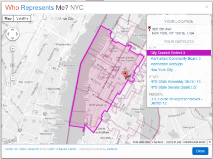
Most important, you can click anywhere on the map and new districts are highlighted for that location. And the list of representatives is automatically updated when you close the map window.
So the maps — combined with the address search and current location feature — enable you to determine elected representatives literally for any and every location in the city.
“Who Represents Me: NYC” has been developed with the generous support of the New York Community Trust.
Geographic data sources for the service include:
The geographic data representing district boundaries is hosted at cartoDB. The overall site design relies on the Twitter Bootstrap framework. We use the Google Maps API for address matching, “typeahead” address search, and basemaps.
Filed under: Apps, Data | Tagged: NYC, online maps, redistricting | 3 Comments »
After I blogged this morning about the frustrations of the City Planning Department’s restrictions on mapped tax parcel data, I learned that the foundation of their “MapPLUTO” product is now available for free online.
This is a partial – but very important – victory for anyone who has been impacted by the city’s burdensome fees and license restrictions associated with MapPLUTO.
The good news is that the Department of Finance has decided to post its “Digital Tax Map” in GIS format online for free download. (Thanks to Colin Reilly for alerting me to the online data.) Here’s the link: https://data.cityofnewyork.us/Property/Department-of-Finance-Digital-Tax-Map/smk3-tmxj
To some extent, this pulls the rug out from under City Planning’s efforts to restrict access to tax parcel data, enabling anyone now to analyze and map the spatial patterns of land use, real property tax assessment, ownership, and more across the five boroughs. Here’s what you’ll need to do:
The “Tax Class 1” and “Tax Classes 2, 3, and 4” assessment roll files contain most, though not all, of what the City Planning Department packages as part of its MapPLUTO product. Some missing items include:
While some of these characteristics can be calculated, others cannot without City Planning’s involvement (since they maintain the data on parcel-by-parcel zoning and FAR, for example).
Also, there can be some confusion over linking assessment roll tabular data to tax parcel boundaries for tax lots that are condos. I can discuss this in a separate blog post, or perhaps others can weigh in on this topic.
So the Digital Tax Map plus the assessment roll files are not a complete replacement for MapPLUTO. That’s one reason this is only a partial victory. I would imagine that the information in these combined files will enable many groups and individuals to avoid using MapPLUTO completely. But other organizations that rely on characteristics such as FAR, detailed zoning, easements, etc will still need the more complete MapPLUTO package.
But the availability of the Digital Tax Map shapefiles greatly undercuts City Planning’s ability to levy fees and impose license restrictions on the public for this data so essential to understanding our city. It underscores how unnecessary it was for City Planning to be involved in selling the data in the first place. For several years now the tax parcel boundaries have been maintained by the Dept of Finance, and the assessment roll data that provides the bulk of PLUTO is created and maintained by Finance too. So why has City Planning been selling data from other agencies as its own?
It also begs the question: now that the Digital Tax Map and the assessment roll data is free online, why is City Planning still selling/licensing MapPLUTO? Is this an oversight on their part? Or does City Planning think they that an unaware public will still come to them for MapPLUTO so they can extract more fees? Either way the fees for MapPLUTO should end immediately, even if it requires the Mayor’s office to step in and require his agencies to comply with Local Law 11.
And it would be more than a nice gesture if the city refunded the past decade’s worth of license fees the city has collected on the backs of local community groups, academic institutions, students, and others who’ve had to pay City Planning in order to access mapped tax parcel data.
Btw, while it’s wonderful the Digital Tax Map files are now available online, I wonder why it took my blog post to reveal the availability of the files?
I’ve known for some time that the Dept of Information Technology and Telecommunications (DoITT) maintains an interactive map displaying the tax parcel boundaries. But there’s no download option at that mapping site for the boundary data.
Also, I regularly check the Finance Department’s website where you can download the assessment roll data. Even today, there’s no mention that the Digital Tax Map is available for free online. Nor does the Finance Department’s web page explaining the Digital Tax Map project mention anything about a download option.
I also regularly search the city’s Open Data Portal, but I hadn’t come across the Digital Tax Map file until Colin posted a comment today at my blog. If you sort the Open Data list by “Newest” or “Recently Updated”, the Digital Tax Map doesn’t show up in the first several pages.
I think this speaks to the need for communication between the agencies that create the data, and the various constituencies of groups that use (or might hope to use) the city’s data sets. Simply posting something to the portal is not enough. If the city truly wants to foster innovation by making its data files more open, it would help if either the agencies or the Mayor’s office or some entity within city government provided regular communication about data that’s available, how to use it, what it shouldn’t be used for, etc.
Nonetheless, the city has taken an important step in opening up access to tax parcel information with the Digital Tax Map. Looking forward to more to come!
Filed under: Data | Tagged: Data, NYC, Policy | 1 Comment »
On behalf of all the urban planning students, local nonprofits, neighborhood groups, Community Boards, journalists, and others who’ve paid cold hard cash to the NYC Department of City Planning for the “privilege” of having license-restricted access to the city’s tax parcel data, I’d like to make a modest proposal:
New York City’s Planning Department should refund the fees they’ve collected for the past decade from all of MapPLUTO’s licensees, and MapPLUTO should be posted online for free downloading.
The MapPLUTO database was conceived by City Planning circa 2003 as the successor to earlier efforts to license and sell tax parcel boundaries.
Based on an article this week from The New York World, City Planning has collected up to $80,000 a year from the sale of MapPLUTO data. Over a decade, that’s $800,000. According to a response from City Planning to a Freedom of Information Law (FOIL) request by 596 Acres for a list of all PLUTO licensees from 2003 to 2012, there have been almost 400 licensees (including several dozen city agencies, which I’ll discuss separately below).
It’s hard to say the exact amounts that each group has paid to City Planning; as far as I know, City Planning has never released a full accounting of the fees they’ve received from MapPLUTO licenses. In this era of transparent government, we should be able to find this out. But this information is hidden behind City Planning’s walls. Even a search for “MapPLUTO” or “PLUTO” at CheckbookNYC reveals nothing.
I do know that my organization, the Center for Urban Research at The Graduate Center / CUNY, has spent $7,500 in MapPLUTO license fees since 2006. Before that, the mapping project I co-founded at NYPIRG also licensed MapPLUTO and paid City Planning several thousand dollars over several years.
That’s real money, especially to a nonprofit group and modest academic research center. And it’s money I think we – and all the other MapPLUTO licensees – never should have had to pay.
(Note: my critique shouldn’t detract from the great work that the Dept of City Planning does in so many other areas, including the other data sets that the agency makes available for free online.)
This week’s New York World article highlights the absurdity of the city’s efforts to charge fees for the data. MapPLUTO is based on data that City Planning obtains from other city agencies. It’s not new data. It’s not data that has been created so that City Planning can sell it. It’s data that’s been compiled using taxpayer dollars, for the purposes of land use analysis and planning. The data has already been paid for by the public, and the Planning Department shouldn’t be justified in charging extra for it.
City Planning has worked hard to keep a lock on the fees they receive (though as I understand it, the Planning Department doesn’t even receive the fees directly – the funds are put in the city’s general fund):
Now that the city’s Open Data Law requires agencies to post data online, City Planning is falling back on the argument that since the MapPLUTO data comes from other agencies, they don’t have to post it (an exemption in the law). It’s up to the other agencies to do so. But as Dominic Mauro from the Transparency Working Group puts it:
If you’re getting paid for this data, I don’t see how they can reasonably claim that this is not their data.
In other words, City Planning can’t have it both ways.
City Planning also claims copyright over the MapPLUTO data. I’m all for giving credit where credit is due – City Planning should be cited whenever MapPLUTO data is used (and for that matter, all the individual agencies from whom City Planning gets the data should be cited as well). But why control what can be done with the data? Why limit its use? This just stifles innovation and entrepreneurship, not to mention any local community planning work that might be prohibited by the license or by copyright.
Indeed, allowing app developers, realtors, architectural firms, consulting groups, and any other for-profit entity to use the city’s tax parcel data at no cost and with no restrictions can only help the city. Removing these restrictions opens up business opportunities, and with business growth comes job creation and tax revenue, precisely the kinds of things that our current Mayor has been keen on promoting.
And removing barriers to MapPLUTO makes it easier for nonprofits, academic institutions, and students to engage in local planning efforts on a level playing field. If only groups that can afford the data can use it, the rest of us are at a disadvantage.
What if you decide to ignore the license or copyright restrictions? City Planning reserves its right to come after you. According to the New York World article, the Department of City Planning says that “Any such use without a license could give rise to an enforcement action.”
An “enforcement action”? Really? When Mayor Bloomberg signed Local Law 11, he said “If we’re going to continue leading the country in innovation and transparency, we’re going to have to make sure that all New Yorkers have access to the data that drives our City.” I don’t think there’s any dispute that real estate is one of the key drivers of the city. So I wonder if Mayor Bloomberg’s planning agency would go after a NYC BigApps entrant who uses MapPLUTO data in a web-based app? Would the Mayor approve of City Planning suing a local nonprofit group that posts the data online? Would he let City Planning take enforcement action against Cornell University if Cornell’s new technology campus developed a profitable product that relied on MapPLUTO data?
And from the perspective of investing tax dollars, would city funds be best spent on lawsuits, or on facilitating innovation?
City Planning’s efforts to control access to MapPLUTO data haven’t been reserved only for those outside city government. The Planning Department has even imposed its restrictions and fees on other city agencies.
According to the list of MapPLUTO licensees uncovered by 596 Acres, City Planning has issued licenses to the Mayor’s Office, the Dept of Information Technology and Telecommuncations (DoITT), the Office of Emergency Management (OEM), the Police Department, the Law Department (presumably they’re the ones who need to review the license in the first place!), the City Council, and several Community Boards.
What possible reason could City Planning have for wanting or needing to know how and why these agencies are using MapPLUTO data? Why should city agencies need to license data from another city agency? And some of these agencies – especially Dept of Finance, but also Parks and Recreation, the Dept of Citywide Administrative Services (DCAS), and the Landmarks Commission – are the very agencies that City Planning gets the data from to create MapPLUTO in the first place!
Not to pile on (but it’s so easy to do with such an absurd situation), City Planning historically has not only required licenses from other city agencies, but City Planning previously required other agencies to pay a fee to obtain tax parcel boundary files. In 2000, for example, not only were the fees for tax parcel data files higher ($1,150 per borough, rather than the current $300/borough fee), but the fees were “$750 per borough for New York City agencies”.
That must’ve made for some interesting discussions among agency heads during budget time. As far as I know, that practice ended soon thereafter. But it’s evidence of City Planning’s inexplicable and ongoing effort to control access to tax parcel data, and to try to profit from it, even from their own colleagues in city government.
Now that the city has a law requiring data to be freely available online, there’s strong justification for removing the fees and the license requirements and copyright restrictions. But frankly, we’ve already had a law requiring data such as MapPLUTO to be made available with no restrictions and for no more than the cost of distribution (such as what it could cost to copy the files to a DVD or to post them online). That’s the New York State Freedom of Information Law, in effect since the mid-1970s.
What’s especially curious – and frustrating – about City Planning’s persistence in restricting access to tax parcel data is that the agency has made great strides in opening up access to other data sets it maintains.
A decade ago City Planning was charging fees to the public and other agencies for data as simple as a GIS file representing borough boundaries, or Census tract boundaries, or Community Boards. One by one the agency has removed these fees and developed what I consider a model website for making agency data publicly accessible: the “Bytes of the Big Apple” website (overly cute name for a very useful site).
Even as recently as Fall 2012, the Planning Department removed the fee it had been charging for its “Geosupport Desktop Edition”, a software and data package that takes a list of street addresses and returns information about each address’s building ID, tax parcel ID, and more. City Planning previously was selling this package for $2,500 a year (and more if you wanted more frequent updates). In terms of the time involved by City Planning to create this application, maintain it, and keep it updated, I would imagine it’s worth much more than the effort to update the MapPLUTO data. Yet “Geosupport” is now free, but we still have to pay for MapPLUTO. I don’t get it.
The time is right for the Department of City Planning to change its ways regarding MapPLUTO – the one remaining major data set it licenses for a fee. I think City Planning should take two simple steps:
Such a sensible proposal!
But what if City Planning continues to dig in its heels? Perhaps you can try the Freedom of Information route and request the data via FOIL. That’s what 596 Acres did, and they received MapPLUTO for a mere $5 fee! City Planning still claimed copyright restrictions, but maybe if City Planning receives enough FOIL requests they’ll be persuaded that there’s no point in maintaining MapPLUTO’s high fees and restrictive licenses. Here’s the link http://www.nyc.gov/html/dcp/html/about/location.shtml#foil
Filed under: Data | Tagged: Data, NYC, Policy | 24 Comments »
The City Council Comparinator site is now embeddable for your website, blog, etc.
Here’s how to use it:
Sample embed code:
We also added a feature: if you turn off the popup window before clicking “Link”, it’ll add a “popup=false” property to the URL, so the person viewing the link (or the starting image for your embedded map) won’t have the popup in the way but the district will still be highlighted.
Here’s an example:

Our Center for Urban Research (CUR) at the CUNY Graduate Center has launched an interactive map today to visualize proposed New York City Council districts compared with existing ones along with the demographic characteristics and patterns within the districts.
The Center hopes the map will help involve people in the NYC districting process simply by showing them how proposed or newly drawn lines looked in relation to their homes or workplaces. Our map is not for drawing districts; others such as the NYC Districting Commission are providing that service. But CUR’s comparison maps are designed to be be engaging enough to visualize the impact of redistricting for everyone from local citizens to redistricting professionals, hopefully inspiring people to participate more actively in the process.
CUR’s map was designed and is being maintained independently from the NYC Districting Commission’s website. However, we hope that people who use CUR’s maps will then access the Districting Commission’s website for drawing maps online.
The main features of the map are as follows:
The mapping application was developed by the Center for Urban Research. David Burgoon, CUR’s application architect, constructed and designed the site, with data analysis support and overall conception from CUR’s Mapping Service director Steven Romalewski.
The application relies on geographic data hosting by cartoDB, open source mapping frameworks and services including OpenLayers and Bing maps, and ESRI’s ArcGIS software for cartography and data analysis.
Current City Council district boundaries and proposed maps from the NYC Districting Commission are based on block assignment lists provided at the Districting Commission’s website.
Other proposed maps such as the Unity Map are provided by the advocacy organizations who developed those proposals.
Filed under: Cartography, GeoWeb | Tagged: Cartography, GeoWeb, NYC, online maps, Policy, redistricting | Comments Off on Interactive “Comparinator” maps launched for NYC Council districting
